
Today is the first thing you see in continuu.it. It's there to answer one question: what are you finishing today?
It grew to 11 sections. Streaks, counters, sleeping projects, stalled ideas, routines, and more. Each one made sense alone. Together they turned Today into noise, and opening the app started to feel like the thing continuu.it is supposed to fix.
So now you choose which sections show, and in what order.
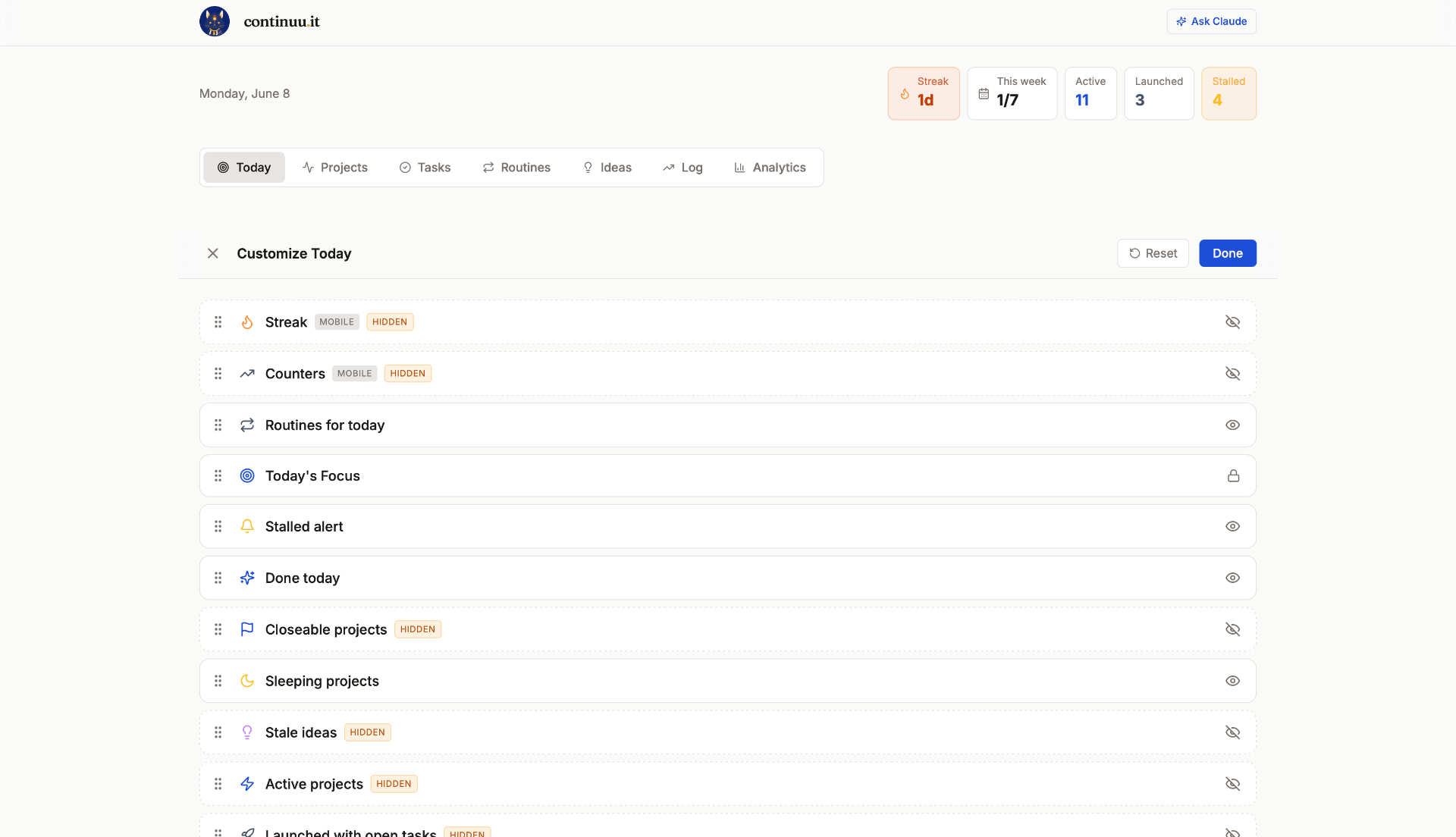
Three decisions shaped it.
Hidden stays hidden. Hide a section and it stays gone, even when new data lands inside it. It's the same respect we give a paused project. You decided. That holds until you change it.
You edit the real screen, not a settings page. Tap the gear and the sections turn into draggable rows you rearrange while looking at your actual Today. No abstract list of checkboxes.
One thing stays locked. Everything can be hidden except Today's Focus, the part that asks what you're working on right now. Hide the rest if you want. That question isn't optional.
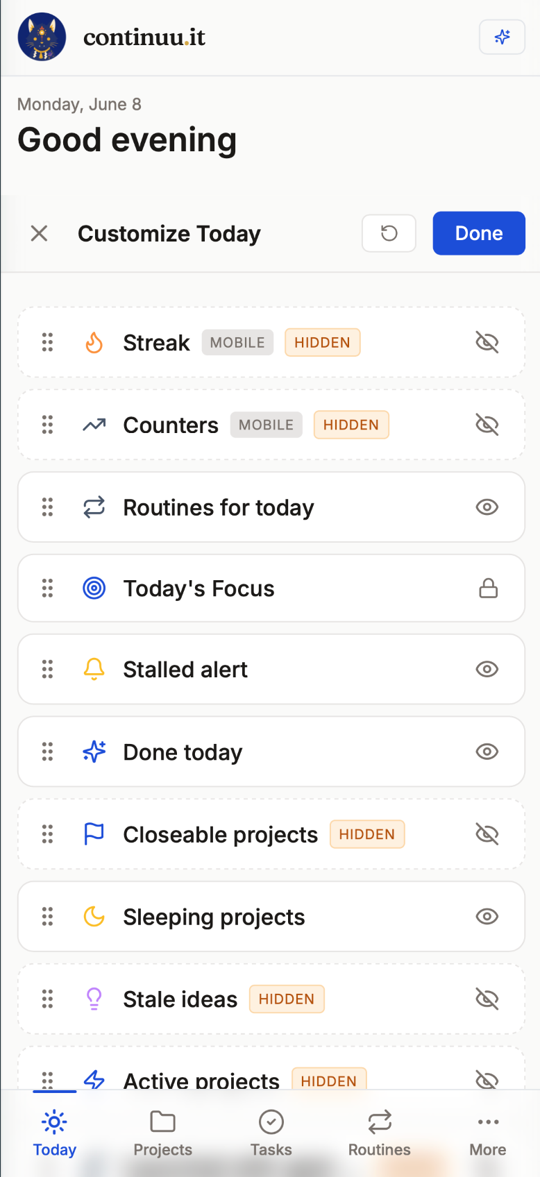
Your layout follows you across web and mobile. And if the AI assistant creates or changes something, Today now refreshes on its own. No manual reload.
The only thing I kept locked is the question that matters most. Everything else, you decide.
A screen that shows you everything is just a louder way to show you nothing.
Finish what you start.